 Have not been shooting much. Cold weather and medical procedures, not feeling well, and been busy with working on renovating an "old" website (www.ma-ript.com), but did manage to edit a few pics from a couple weeks ago.
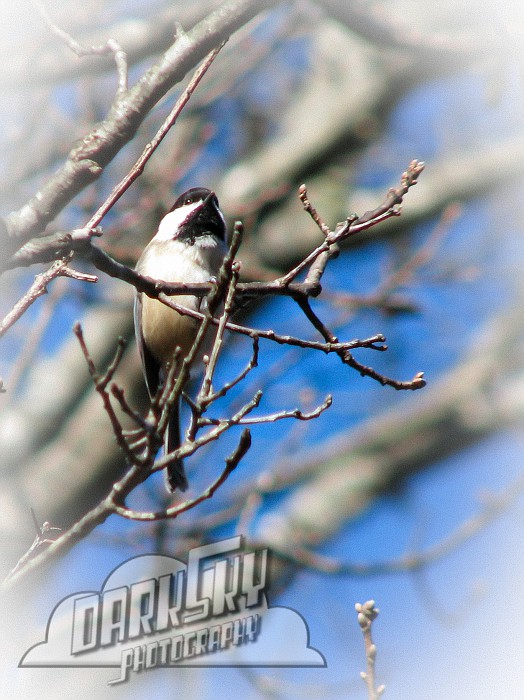
I did find some time to design this watermark/logo as well. I also made a version that is black with white outline, the opposite of this one, which I think looks better. I wish I could just have the white outline with a transparent background...not sure how that would show over the photos though...or maybe white outline with a black shadow.
I didn't use any software that I have. I made it at www.cooltext.com and imported the generated pic into lightroom to be used as a watermark.
Anyway, I kind of like it but I think it may be a little too much. What do you think of it? Any ideas or suggestions?
Comments